All news in the category New Project

NETEC Identity
New Project

Webster designs new identity system for NETEC

We just recently finished an identity for the National Ebola Training and Education Center. NETEC is comprised of faculty and staff from Emory University, the University of Nebraska Medical Center/Nebraska Medicine and the New York Health and Hospitals Corporation, Bellevue Hospital Center. All three of these health care institutions have safely and successfully treated patients with Ebola and have worked diligently to share their knowledge with other health care facilities and public health jurisdictions. The goal of NETEC is to combine these resources into one comprehensive assessment, educational and training tool for health care systems throughout the United States.

View the work

New Project

Webster designs Union Pacific Golden Spike website

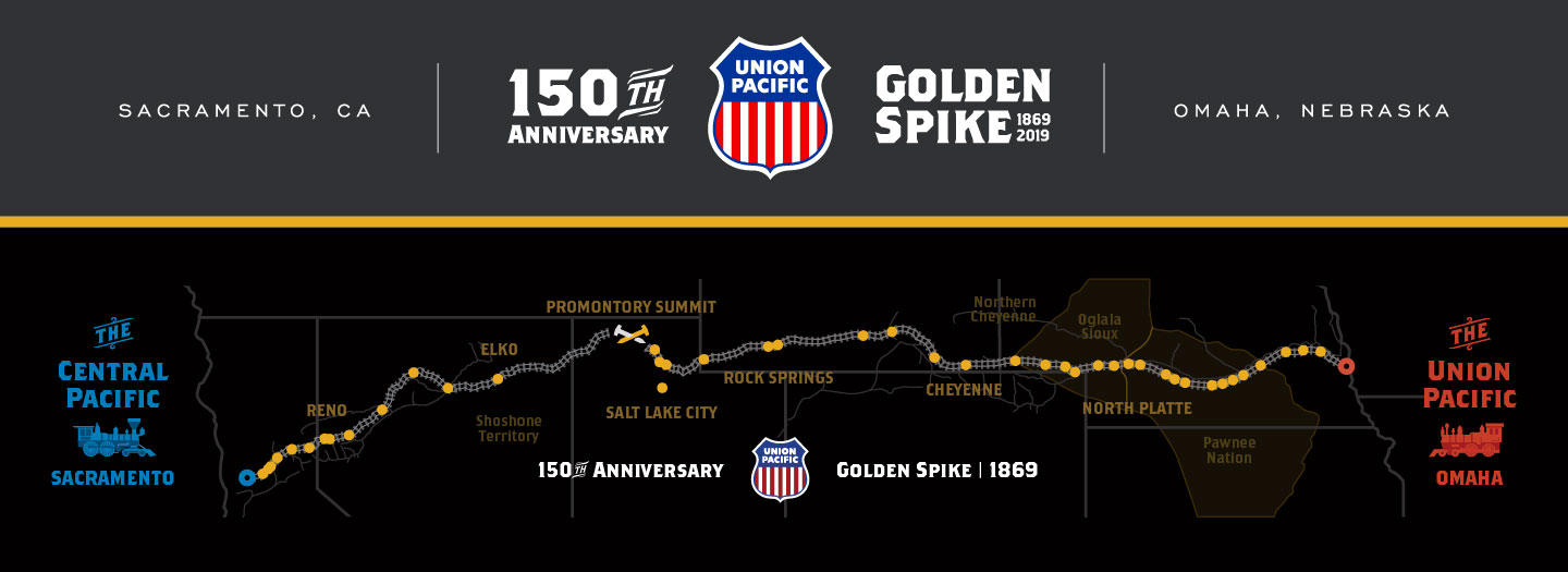
Union Pacific chose Webster to create a website commemorating the 150th anniversary of the driving of the Golden Spike in Promontory Summit, UT. Through stories, images and events in communities along the route of the Transcontinental Railroad, we built an engaging and educational experience that can be viewed and shared on any device by a wide-ranging audience.

The primary directive from Union Pacific was to keep a focus on the communities, while also conveying a sense of the scale, distance travelled (1775 miles) and heated competition between the Union Pacific and Central Pacific railroads.

By visually building the track’s progress while a visitor scrolls through the community stories and overlaying it on a custom vector map, precisely rendered in real-time, we simultaneously communicated the intense competition and the scale of this monumental undertaking without requiring visitors to suffer through a lengthy “loading” screen. We went a step further and created a fun locomotive in motion GIF to further reduce the visitors’ perception of loading time.

Anyone can share information about their community using the unique community profile. The potential of this website for students and researchers is amplified through a full reference-style instant search that makes finding locations, dates, and important figures easy. The website will permanently reside on UP.com after the 150th Anniversary celebration and related events have passed.

www.up.com/goldenspike
Boston Properties 2016 Annual Report
New Project

Boston Properties 2016 Annual Report

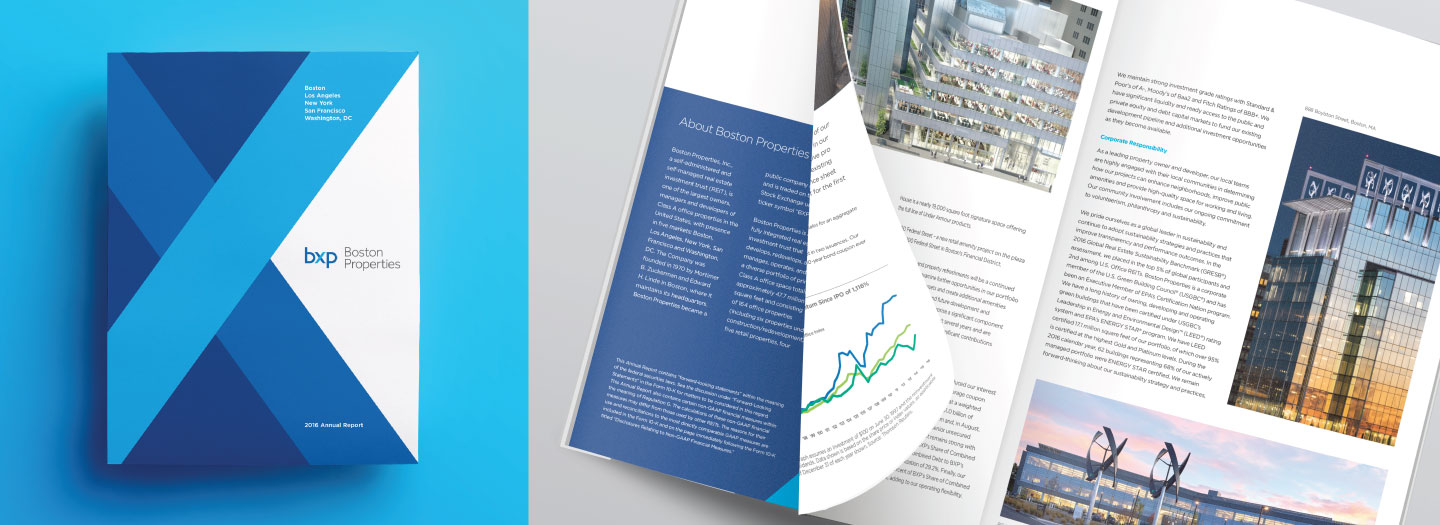
Boston Properties, a real estate investment trust (REIT) headquartered in – you guessed it – Boston, MA, is one of the largest owners, managers and developers of first-class office properties in the United States, with significant presence in five markets: Boston, Los Angeles, New York, San Francisco and Washington, DC. The cover is a celebration of the new Boston Properties (BXP) logo. If you happen to find yourself in Boston, make sure to stop by the Prudential Center. It’s not only home to Boston Properties, but exciting new retail spaces like the Under Armour Brand House and Eataly.

Green Plains 2016 Annual Report
New Project

Green Plains 2016 Annual Report

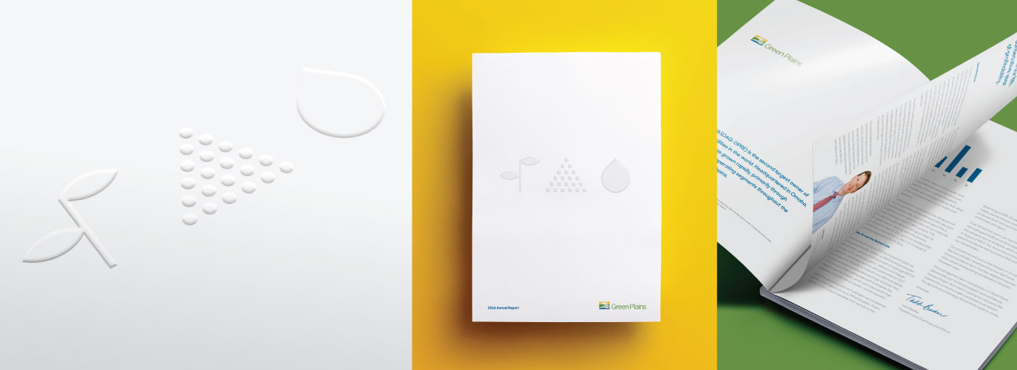
Green Plains is one of the fastest-growing companies in the region, currently in the Fortune 1,000 with a bullet. They are experts at buying and selling commodities, as well as turning corn into food, feed and fuel. They are smart, innovative, hardworking people and we couldn’t be happier to be working with them. This featured piece of work is their 2016 annual report, with blind-embossed food, feed and fuel icons. There is a lot of exciting stuff going on at Green Plains, so be on the lookout for more great work from the Green Plains + Webster team.

fat brain toys new logo
New Project

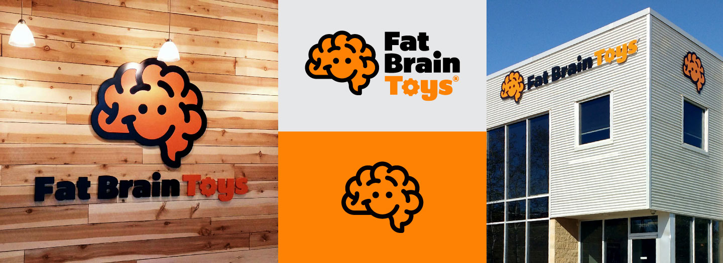
Collaborating on the new Fat Brain Toys Logo

Fat Brain Toys came to us late last year after working internally on a new logo with the only outcome frustration and divided consensus. Their internal design team had hit the wall and they just needed some professional help and an outside perspective. Sometimes the best thing to do when you are working on a project, and get stuck, is to get another perspective. We met with them several times to really listen and gather all of their thoughts and vision for the new logo. The previous logo was created in 2004 and hadn’t been updated or touched since due to growth of the business, new physical stores and other distractions that happen when owning a business.

After our meetings, we came back to our office and designed our own take on what they needed. We presented several rounds of logo options and through the process came back to a version that was similar to what they had designed in-house, but was then taken in a new, fresh direction that was different and ownable for Fat Brain Toys going forward. It was a unique collaboration that isn’t our normal process, but we couldn’t resist helping such a great local business.

Below is an article on the Fat Brain Toys blog about the logo process from their perspective.
A Logo Resolution for the New Year

Croppings of the calendar illustrations
New Project

2017 Field Paper Calendar

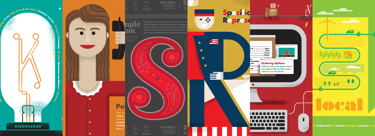
Webster was honored to design and illustrate the Field Paper Company 2017 calendar. Every year Field uses the calendar as a promotional piece for printers and designers to remind them of the commitment Field makes to the printing, design and advertising community of Iowa and Nebraska. The 2017 theme is “At Your Service,” which speaks to the hands-on approach Field takes with its clients. No robots. No answering services. No flak. Just good-old, down-home customer service. When you call, you get a person that knows your account and listens to what you need. If you want a copy, you better call Megan Rold at Field Paper today.

Omaha Human Rights and Relations Department Logo, Billboard and Brochure
New Project

Omaha City Government Taps Webster to Tout Fairness

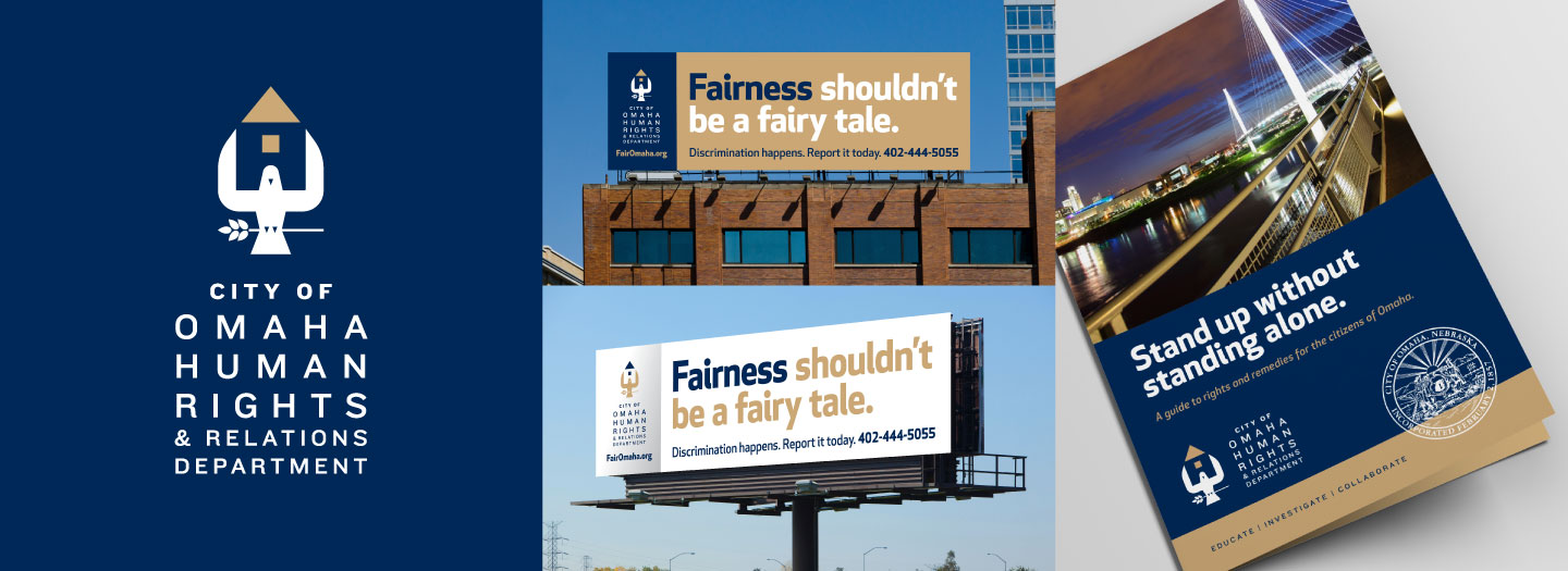
In an effort to promote both their everyday anti-discrimination duties along with National Fair Housing Month, the City of Omaha Human Rights & Relations Department wanted to give their materials a bit less of, shall we say, an institutional look. We obliged with a new departmental logo and letterhead package, revised services collateral, and a mini outdoor campaign. None of which are in any way middling.

View the work

New Project

Webster Gives an Omaha Favorite a Digital Overhaul

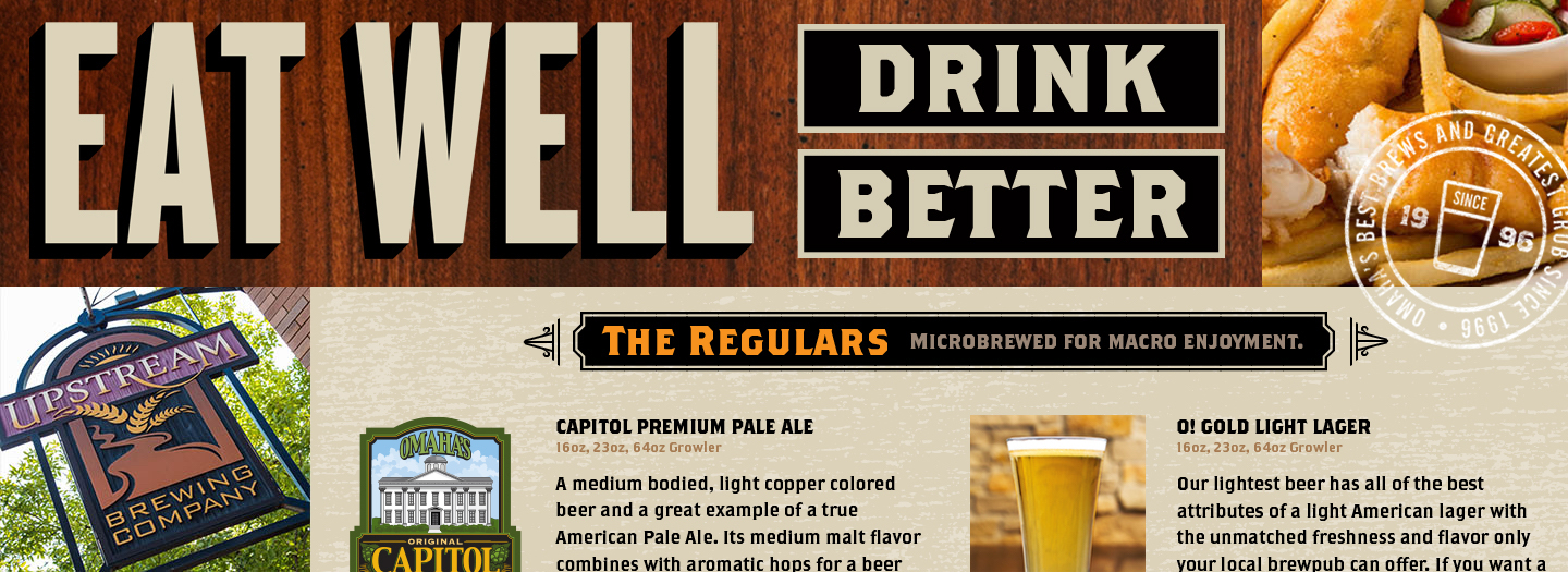
When Upstream Brewing Company opened its first location in Omaha’s Old Market in 1996, it was the city’s only brewpub. Twenty years and a West O location later, Upstream had successfully remained a cornerstone of the area’s dining & drinking scene. It had also remained resolutely planted in the digital landscape of the mid-aughts with a site that was no longer up to current usability, functionality or tonality standards. So we redid it. A new look, a sharpened tone of voice, built-in responsiveness and a lack of forced PDF menu downloading now combine to make Upstream’s digital living space as welcoming as their dining rooms.

View the work

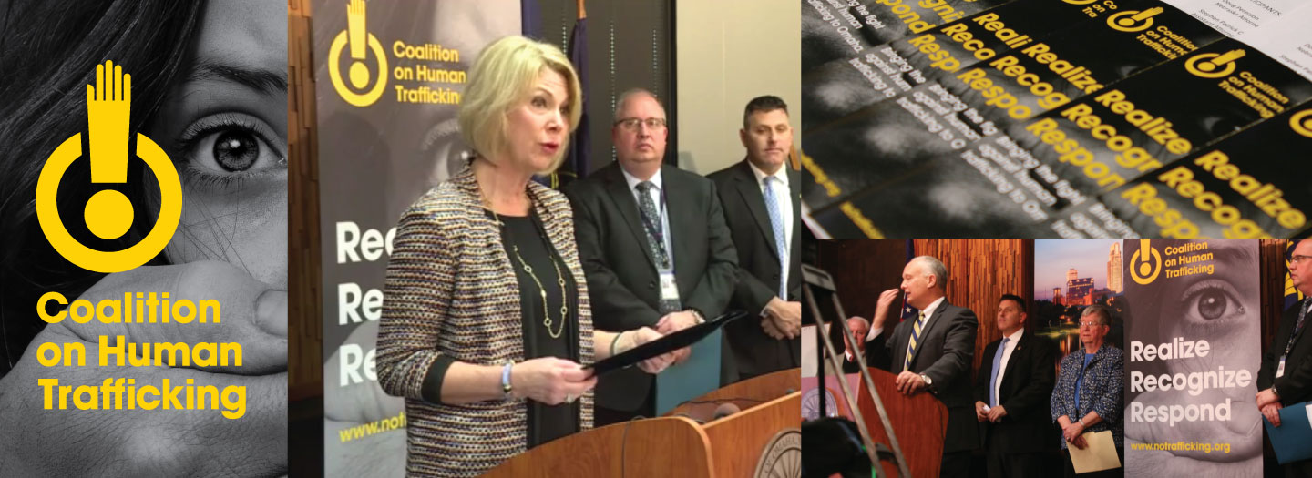
Coalition on Human Trafficking City Press Conference
New Project, Non-profit

Webster Helps Fight Human Trafficking

The Coalition on Human Trafficking is a new non-profit organization dedicated to ending sex trafficking in the Omaha area. Working on behalf of the AAF Omaha and in collaboration with Angel Carl Marketing, we designed the CoHT’s logo, brand look and feel, and other creative assets (the official website is still in development). The work was revealed to the public at a press conference earlier today (January 27, 2016) featuring CoHT leadership, the mayor of Omaha, the city’s police chief, and members of the Nebraska Human Trafficking Task Force. We hope what we believe is some very good design work will help in the fight against some very evil activities.

View the work